Didriksons
Client
Didriksons
Duration: 10/04 2024 -25/06 2024
Role
UX/UI Designer
Tools
Figma
Research Methods
- Cognitive Walkthrough
- Usability Testing
- Semi-structured Interviews
- Wireframes
Project Overview
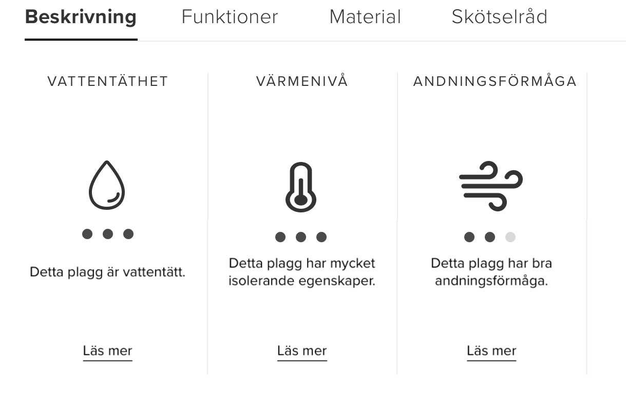
In collaboration with the outdoor clothing brand Didriksons, my team and I were tasked with evaluating the visual scales on their website. Rather than reviewing the entire site, we focused specifically on this key component to improve clarity, accessibility, and user understanding. The project challenged us to dive deep into user perspective and apply UX principles in a highly targeted way.
Problem
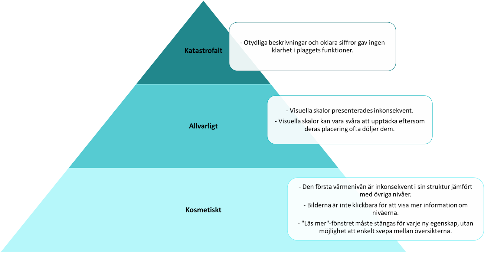
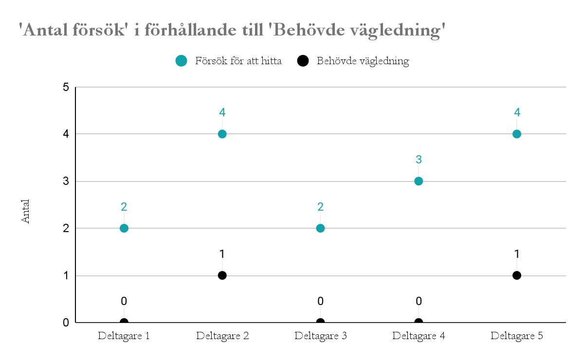
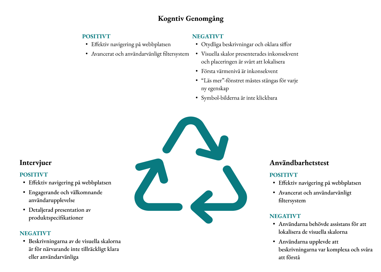
Didriksons had identified that many users either misunderstood the visual scales or failed to notice them altogether. Our evaluation began with defining the target audience—primarily men and women aged 25–44—followed by a cognitive walkthrough of the site. We created realistic scenarios and observed test participants as they navigated the website, later conducting interviews to gather qualitative insights. Several issues emerged, including hidden or poorly placed information and a lack of context for interpreting the scales.
Results
Based on our findings, we provided concrete suggestions to improve the usability and visibility of the scales. These included more intuitive placement, clearer labels, and visual enhancements that made the scales easier to interpret at a glance. The result was a set of actionable recommendations designed to support user confidence and decision-making—turning a previously overlooked element into a more engaging and informative part of the customer experience.